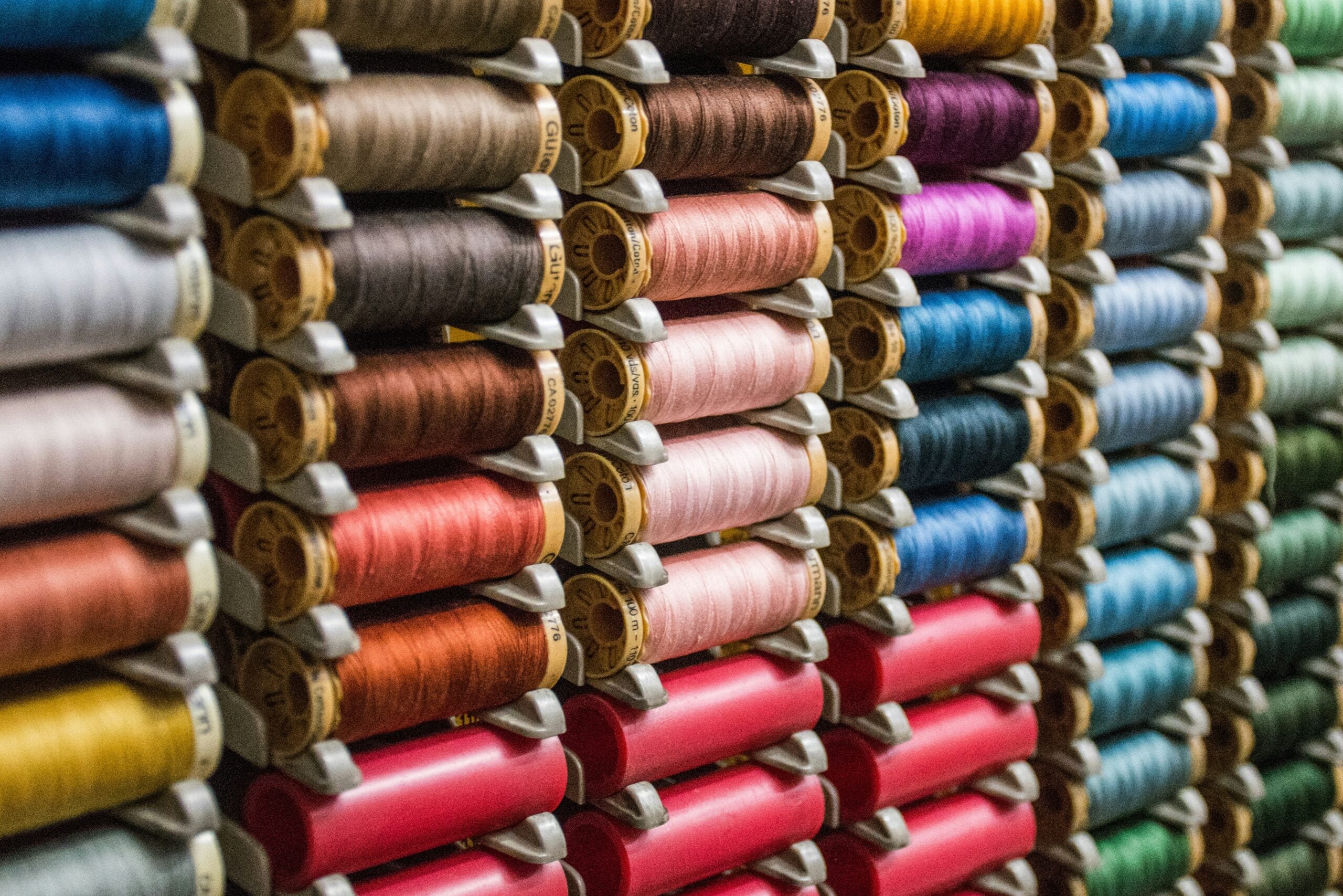
Have you ever looked at a beautifully tailored jacket or a vibrant patterned dress and wondered why the stitching looks so perfectly placed? As consumers, we rarely think about the thread holding our clothes together unless something goes wrong. We just see a finished garment, but behind the scenes, selecting the exact shade for a production run is a highly precise process. It takes more than simply holding a spool up to a bolt of fabric and hoping for the best.
When a factory prepares for a large manufacturing run, sourcing the right commercial sewing thread requires balancing aesthetics, material science, and brand consistency. Retail manufacturers evaluate everything from lighting conditions and fabric composition to the specific purpose of the seam itself. Here’s how the apparel industry picks the perfect color for every single item on the rack.
Lighting and the Metamerism Effect
Before manufacturers even look at a color wheel, they consider the lighting. You’ve probably experienced this yourself: you buy a black shirt in a poorly lit store, only to realize it looks navy blue when you step out into the sun. This phenomenon is called metamerism. Different light sources cast different color temperatures, which drastically change how our eyes perceive dyed textiles.
Retail manufacturers use specialized light boxes to evaluate samples against fabric swatches. These boxes simulate multiple lighting environments, like fluorescent store fixtures, incandescent home lamps, and natural daylight. A spool might be a perfect match under a factory fluorescent bulb but clash terribly when the garment is worn outside. Quality control teams review the pairing under all these conditions to ensure the shade remains complementary regardless of where the customer wears the clothing.
The Rule of the Darker Shade
When stitching a solid fabric, you’d assume the goal is finding an exact match. However, due to how light hits a twisted thread’s rounded surface versus a fabric’s flat weave, a perfect visual match is rare.
Instead, manufacturers rely on a well-known industry standard: always err on the side of a slightly darker shade. If a thread is even a fraction lighter than the fabric, it catches the light and stands out, making the seam look cheap or distracting. Conversely, a slightly darker tone visually sinks into the natural shadows created by the folds and seams of the garment. This optical illusion helps the stitching disappear entirely, giving the piece a clean, seamless finish.
Navigating Complex Prints and Patterns
Solid fabrics are relatively straightforward, but what happens when a manufacturer creates a floral dress with five different colors? Picking an option for a multicolored pattern requires prioritizing specific elements of the design.
Usually, the default strategy is matching the thread to the background color of the print. If a fabric features bright pink and yellow flowers scattered across a charcoal gray background, a charcoal spool disguises the seams best, but sometimes, a print lacks a solid background entirely. In these cases, designers squint at the fabric from a distance to see which mid-tone color dominates the visual field. They select a shade matching that dominant mid-tone so the stitching blends organically into the overall palette without competing with the brighter accent colors.
Translating Pantone to Physical Fibers
Brand consistency is a major factor, especially for corporate apparel, embroidered logos, and recognizable fashion labels. A brand usually has a highly specific color palette defined by the Pantone Matching System. When a company orders ten thousand polo shirts for their employees, they expect the embroidered logo to match their exact brand guidelines.
Thread manufacturers provide detailed conversion charts that map these digital Pantone codes to their physical inventory. However, translating a flat ink color into a dyed, three-dimensional fiber is a complex challenge. To ensure the color meets brand standards, decorators run test stitches on the actual production fabric. The background fabric color can subtly shift how the embroidered logo reads to the eye. A red logo stitched onto a white shirt looks remarkably different than the exact same red stitched onto a black shirt.
Decorative Versus Functional Stitching
The intended purpose of the seam strongly influences the color choice. Manufacturers divide their stitching into two main categories: functional and decorative. Functional seams hold the garment together from the inside. For these hidden seams, manufacturers often use large cones of neutral colors like gray, tan, black, or white. Using versatile neutral shades for internal serging and piecing saves time and money, as workers don’t have to constantly swap out spools on the machines for every new fabric color.
Decorative stitching, commonly known as topstitching, is meant to be seen. It acts as a distinct design element. The most famous example is the classic golden-orange topstitching used on blue jeans. When choosing a contrasting color for topstitching, designers look for shades on the opposite side of the color wheel to make the design pop. They must be incredibly careful with these selections, as high-contrast topstitching highlights every single needle puncture. If the tension is off or the line wavers even slightly, the contrasting color broadcasts that flaw to the buyer.
How Material Alters the Color
Manufacturers also know that the fiber content changes its visual color. Different materials absorb dye and reflect light in distinct ways. A mercerized cotton thread has a soft, matte finish that blends beautifully into natural fabrics like linen and quilting cotton. On the other hand, a polyester or rayon alternative has a distinct sheen.
If a designer wants the stitching to remain invisible, they’ll match the luster of the thread to the luster of the fabric. Using a shiny polyester option on a matte cotton canvas makes the seam highly visible, even if the shade is a perfect technical match. By coordinating both the hue and the fiber finish, manufacturers control exactly how much attention the seam draws.